Analysis overview
High replicate, quantitative data is a key Institute goal, as it greatly facilitates meaningful analysis, prediction and theory. Our initial project on cell organization reveals the enormous variance in the organization of the cells, raising questions about the nature of this variance and its biological origin (cell cycle, differentiation, etc.) and function. Our first set of analyses address this by defining a common coordinate framework and enabling statistical analyses appropriate for these relatively large datasets.
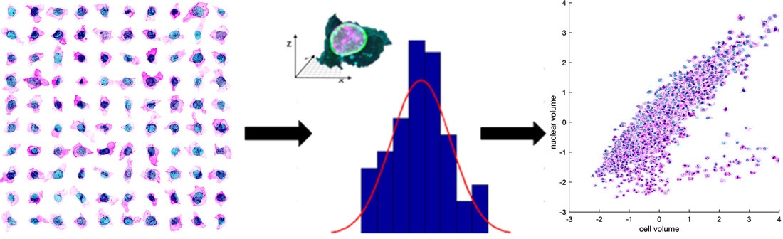
Figure 1. Exploring cell variation. The images produced by our pipeline reveal great variability in the cells. As a first step, we’ve plotted key features in our population to illustrate the magnitude of the variance, some general trends, and a sample of interesting potential relationships.
Analysis of cell variation
Analysis of variance overview
The high-resolution 3D images produced by our imaging pipeline are dense with information, including the positions and shapes of the nucleus (DNA dye), the cell membrane (membrane dye) and the GFP-tagged protein associated with the different cellular organelles (see About Our Cells). Cell measurements were made from cells at the center of each colony to ensure reproducibility; nevertheless, we capture interesting variance in our initial population. As a first glance into the extent of the variation in organization of these cells, we have plotted some key properties of the cells versus others. Representative images are available, to show these specific features at high resolution and characterize major regions of the plots, which show both general trends and outliers. Another section of the website features an interactive plotting tool, which you can use to create your own analyses; we anticipate that new trends will become apparent as you explore the data.
Our approach defines a common coordinate framework for cells, considering structures with respect to the cell membrane and nucleus to enable comparisons among them. Furthermore, for image-data sets comprised of thousands of cells, it is useful to automate the analysis, rather than examining and measuring each image individually. We can then more easily probe core questions such as how cells vary within a specific population, where key organelles are located in our cells, and how they may change their organization during the cell cycle.
|
|
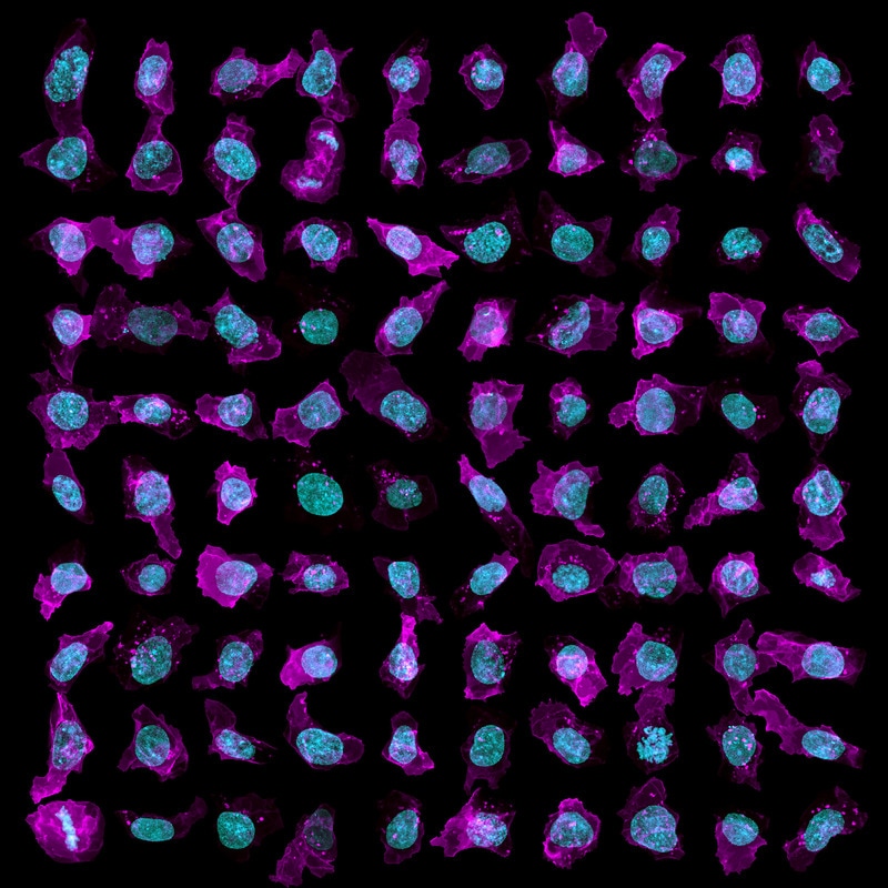
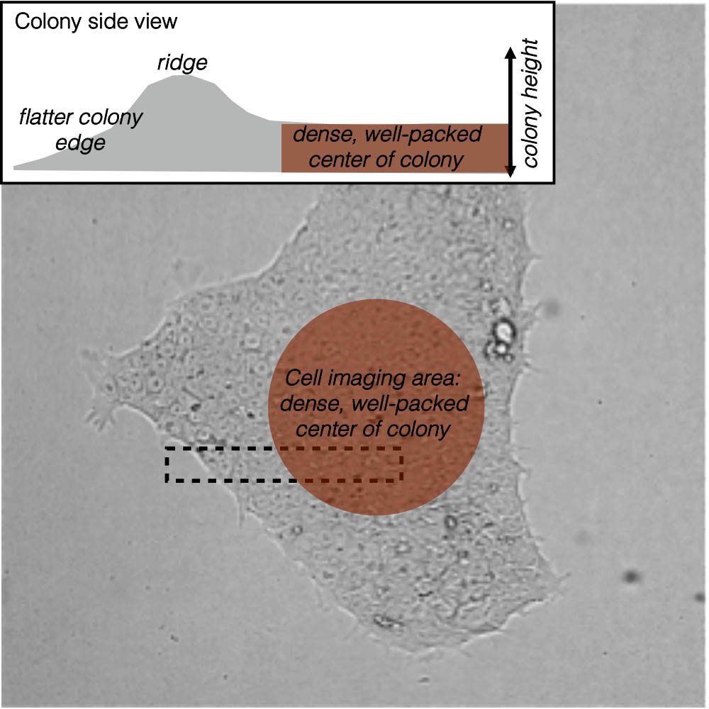
Figure 2. A snapshot of cell and nuclear variability. Our cells vary widely in shape, as can be seen in this top-down (maximum intensity) view of a subset of the population; cell membrane in magenta and DNA (nucleus) in cyan (at left). The cell imaging area for this population is a dense, well-packed area at the center of each colony (at right).
|
|
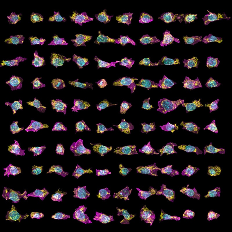
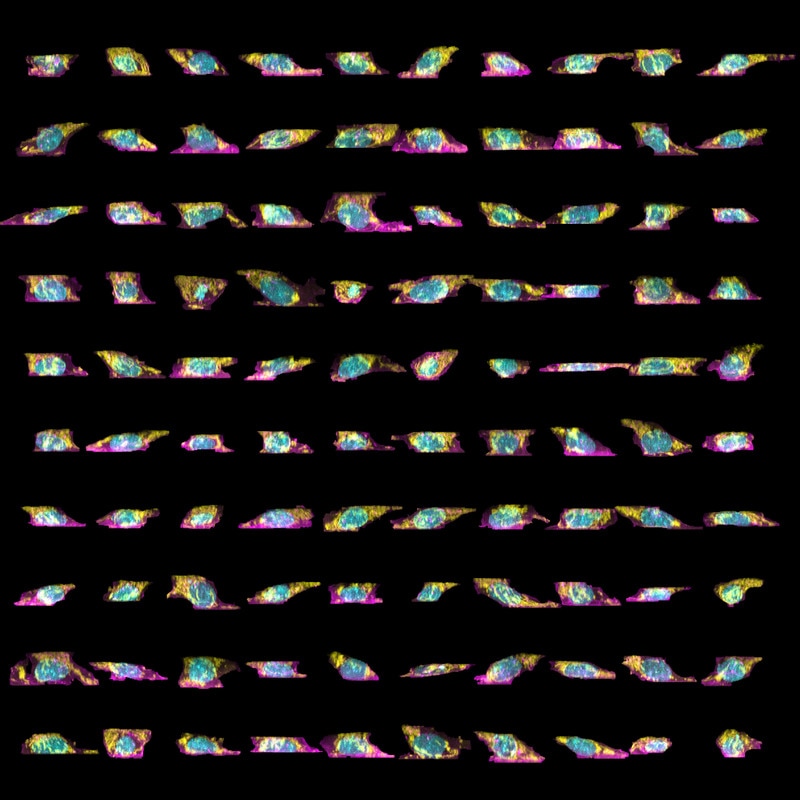
Figure 3. Variability in organelle shape and position in our cells. The top-down (left) and side (right) maximum intensity views of a subpopulation of mEGFP-tagged Tom20 (marking the mitochondria) clonal line cells. As above, cell membrane shown in magenta, DNA (nucleus) in cyan, and Tom20 (mitochondria) in yellow.
Exploring variation in cell and nuclear size and shape, and variance of structure location with cell size.
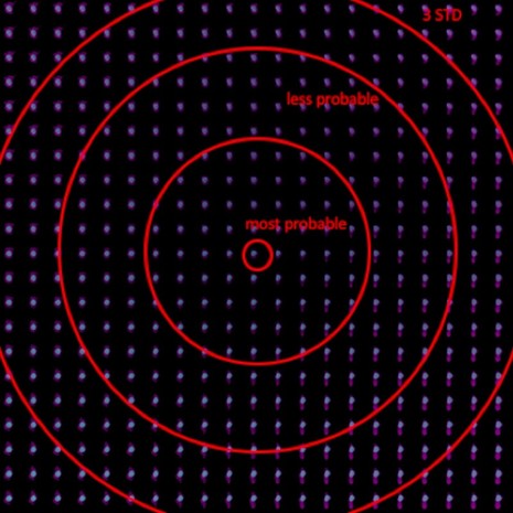
Below are five examples of scatter plots which illustrate variance in our sample population. We show this data in each plot in four ways: as traditional points, as a probability density estimation to show where most of the data points cluster, as the actual cells for which the data was produced, and a gridded version of the latter, wherein select cells are quantized to an underlying grid, to facilitate visual clarity of the shape variance in the population. In each plot, 3 example cells that represent the average of the population as well as its extremes are labeled on the graph. These cells are enlarged in an interactive, rotatable format for 3D study here, and can be loaded into the 3D Cell Viewer by clicking the provided links.
Below are five examples of scatter plots which illustrate variance in our sample population. We show this data in each plot in four ways: as traditional points, as a probability density estimation to show where most of the data points cluster, as the actual cells for which the data was produced, and a gridded version of the latter, wherein select cells are quantized to an underlying grid, to facilitate visual clarity of the shape variance in the population. In each plot, 3 example cells that represent the average of the population as well as its extremes are labeled on the graph. These cells are enlarged in an interactive, rotatable format for 3D study here, and can be loaded into the 3D Cell Viewer by clicking the provided links.
|
A. AICS-14_248_4
|
B. AICS-16_7_3
|
C. AICS-14_173_5
|
Figure 4. Variation of nuclear volume with cell volume. Plotting cell volume (x-axis) versus nuclear (DNA) volume in units of standard deviation (z-score; y-axis) for our sample population of 6,077 cells yields an approximately linear correlation. The exception is mitotic cells, which have a low apparent volume of DNA, due to its compaction during division, as compared to the overall cell volume (see cluster emerging at lower right of plot). Cell membrane in magenta, DNA (nucleus) in cyan.
|
A. AICS-12_226_5
|
B. AICS-7_106_6
|
C. AICS-11_106_1
|
Figure 5. Variation of nuclear volume with nuclear eccentricity. A plot of nuclear (DNA) volume (x-axis) versus nuclear (DNA) eccentricity (in units of standard deviation or z-score; y-axis) for our sample population of 6,077 cells. The effect of the cell cycle is immediately apparent. Cells with average nuclear volume and nuclear eccentricity tend to have nuclei which appear to be in interphase. Mitotic cells, lacking a defined nucleus and showing lower total apparent DNA volume with higher eccentricity (due to compaction), form a cluster at the upper left of the plot.
|
A. AICS-23_15_7
|
B. AICS-23_53_2
|
C. AICS-23_31_1
|
Figure 6. Cell volume and position of tight-junctions along the apical-basal axis of the cell. A plot of cell volume (x-axis) versus the apical proximity (see inset) of mEGFP-tagged ZO-1 (tight junction protein) in units of standard deviation (z-score; y-axis). The distribution shows that protein localization biases to the apical region (top) of the columnar cells (values for apical proximity biasing >1), as expected and which is immediately apparent from cell examples. Cell membrane in magenta, DNA (nucleus) in blue, and ZO-1 (tight junction protein) in cyan.
|
A. AICS-13_91_1
|
B. AICS-13_4_4
|
C. AICS-13_234_5
|
Figure 7. Cell volume and nuclear position along the apical-basal axis of the cell. A plot of cell volume (x-axis) versus the apical proximity (see inset) of the nuclear membrane, as visualized with mEGFP-tagged Lamin B1 in units of standard deviation (z-score; y-axis). The nuclei are large and distribute around an average independent of cell size (outliers appear as primarily mitotic). Nuclear apical proximity is relatively invariant to cell volume in these cells, as seen by cells’ clustering at apical proximity values near 0. Cell membrane in magenta, DNA (nucleus) in blue, and LaminB1 (nuclear membrane) in cyan.
|
A. AICS-11_56_8
|
B. AICS-11_161_1
|
C. AICS-11_26_6
|
Figure 8. The apical-basal positioning of mitochondria. A plot of cell volume (x-axis) versus the apical proximity (see inset) of mEGFP-tagged Tom20 (mitochondria) in units of standard deviation (z-score; y-axis) reveals a wide distribution wherein mitochondria are often found in a discrete region or “pocket” in the apical region of these columnar cells. Apical proximity is relatively invariant to cell volume in this population. Cell membrane in magenta, DNA (nucleus) in cyan, and Tom20 (mitochondria) in cyan.
“Deep learning” captures and models cell variability
We have developed and implemented a state-of-the-art statistical model, the Integrated Cell Model, which captures the relative variations in cell and organelle morphologies and locations for all components studied. Like traditional statistical approaches, this model similarly allows us to analyze variance in our cell population – with a powerful difference. This Integrated Cell Model can capture and analyze all of the variation among components of our cells and predict the locations of structures not observed in any particular sample. In addition, the model allows us to both predict how cells and their components will look given certain conditions and to integrate cells with components observed in different measurements (see Modeling: Integrated Cells for more information).
|
Figure 9. The Integrated Cell Model captures cell and nuclear variation. This plot shows two dimensions from a high dimensional variable capturing an integrated statistical view of the cell and nucleus. Note the smooth transition as we move from the center of the plot (the most probable cells) to the exterior (three standard deviations from the norm). See the Modeling: Integrated Cells for a description of the model.
|
|
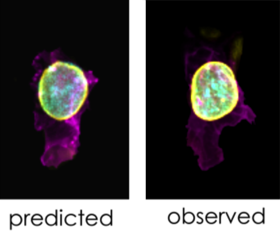
Figure 10. The Integrated Cell Model can also predict structure localization and morphology. The Allen Cell Collection includes an mEGFP-tagged Lamin B1 (nuclear membrane) gene-edited clonal cell line. In the figure, we show two representative cells from this line. At left, a cell generated by our Integrated Cell Model predicts where this protein will be found, based on the location of the cell membrane and DNA (in magenta and cyan, respectively). The position of LaminB1 (nuclear membrane; yellow) is correctly predicted to surround the nucleus (DNA); an example cell from our experimental observations (at right) reveals a very similar pattern of LaminB1 with respect to the DNA.
|
|
Glossary of cell "feature" plotting axis terms
Cell volume: the volume of a cell, as measured by segmented voxels and associated edge length, in units of femtoliter (fL).
Nuclear volume: the volume of a nucleus of a given cell, as measured by segmented voxels and associated edge length, in units of femtoliter (fL).
Nuclear volume: the volume of a nucleus of a given cell, as measured by segmented voxels and associated edge length, in units of femtoliter (fL).
Cell surface area:
the surface area of a cell, as measured by segmented pixels and associated edge length, in units of µm2.
Nuclear surface area: the surface area of a nucleus of a given cell as measured by segmented pixels and associated edge length, in units of µm2.
Nuclear surface area: the surface area of a nucleus of a given cell as measured by segmented pixels and associated edge length, in units of µm2.
Apical proximity: an intensity-derived image feature, defined as the optical intensity of a structure found in the top (apical) half of a roughly columnar cell as compared to the basal (bottom) half of this cell, scaled from -1 to 1. A cell in which all of the fluorescent intensity was in the top half would have an apical proximity of 1; whereas a structure that was evenly distributed between the apical and basal halves would have an apical proximity of 0. See Figure 11 for illustration.
Radial proximity: an intensity-derived image feature, defined as the optical intensity of a structure found in the more external shell of a roughly columnar cell (closer to the cell exterior) as compared to the more internal columnar core of the same cell (closer to the cell center), scaled from -1 to 1. A cell in which all of the fluorescence intensity was at the center of the cell would have a radial proximity of -1; whereas a structure that was at cell boundary would have a radial proximity of 1. See the Figure 11 for illustration.
Nuclear eccentricity: a measure of how much the nucleus deviates from a spherical shape, presented as a number between 0 and 1. A completely spherical nucleus would have an eccentricity of 0, one with the shape of an elliptical 3D solid would have an eccentricity of 0.5, whereas a 3D conical distribution would be assigned a value of 1 (the 3D-shape has ceased to be a closed-surface, sphere-like solid). See the Figure 12 for illustration.
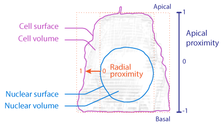
Figure 11. Apical and radial proximity describe voxel localization tendencies towards the top or outside of the cell respectively.
|

Figure 12. Nuclear eccentricity differentiates spherical vs planar shapes.
|